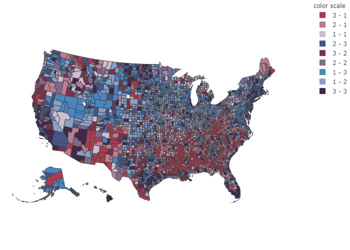
United States’ Income Inequality

Follow along on Google Colab.
License
The license for the code and the visual: CC BY-SA 4.0.
Introduction
This was inspired by the Switerland’s regional income (in-equality) thematic map by Timo Grossenbacher and Angelo Zehr. Grossenbacher and Zehr’s map was generated using ggplot2 and sf from R, and uses geographical features to enhance the visual. However, this map of the United States’ Income Inequality was generated using plotly on Python, and touched up with Adobe Illustrator. Furthermore, this does not consider geographical features, but it would be interesting to implement if the data are available.
This was originally posted on r/dataisbeautiful.
Import packages
# Data
from urllib.request import urlopen
import json
import pandas as pd

# Plotly
import plotly.express as px
Data
OUTPUT_PATH = Path.cwd().joinpath('output').resolve()

# create output path if it does not exist:
OUTPUT_PATH.mkdir(parents=True, exist_ok=True)
with urlopen('https://raw.githubusercontent.com/plotly/datasets/master/geojson-counties-fips.json') as response:
    counties = json.load(response)
The geojson file containing the geometries for the counties was posted by plotly on their Github.
df_gini = pd.read_csv(r'https://raw.githubusercontent.com/lokdoesdata/us-income-inequality/main/data/gini.csv')
df_income = pd.read_csv(r'https://raw.githubusercontent.com/lokdoesdata/us-income-inequality/main/data/income.csv')

df = df_gini.merge(df_income[['GEO_ID', 'Mean Income']], on = 'GEO_ID')
df['fips'] = df['GEO_ID'].str[-5:]
The data used were the Gini index of income inequality and the mean income by county. They were both obtained from the United States’ Census 2018 ACS 5-Year Estimates.
Calculation
gini_1 = df['Gini'].quantile(1/3)
gini_2 = df['Gini'].quantile(2/3)

df['gini quartile'] = df['Gini'].apply(
    lambda x: 3 if x >= gini_2 else 2 if x >= gini_1 else 1)

income_1 = df['Mean Income'].quantile(1/3)
income_2 = df['Mean Income'].quantile(2/3)

df['income quartile'] = df['Mean Income'].apply(
    lambda x: 3 if x >= income_2 else 2 if x >= income_1 else 1)

df['color scale'] = df['gini quartile'].astype(str) + ' - ' + df['income quartile'].astype(str)
Both Gini index and Mean income were divided into thirds based on the percentile. Combining the two creates a three-by-three bivariate color scale.
Visual
color_scale = {
    '3 - 3': '#3F2949', # high inequality, high income
    '2 - 3': '#435786',
    '1 - 3': '#4885C1', # low inequality, high income
    '3 - 2': '#77324C',
    '2 - 2': '#806A8A', # medium inequality, medium income
    '1 - 2': '#89A1C8',
    '3 - 1': '#AE3A4E', # high inequality, low income
    '2 - 1': '#BC7C8F',
    '1 - 1': '#CABED0', # low inequality, low income
}

fig = px.choropleth(df,
                    geojson=counties,
                    locations='fips',
                    color='color scale',
                    color_discrete_map=color_scale,
                    scope='usa'
                   )

fig.update_layout(margin={'r':0, 't':0, 'l':0, 'b':0})

The visual was exported into a PDF and additional enhancements were done on Adobe Illustrator.